
"The Champagne Project"


"The Champagne Project"
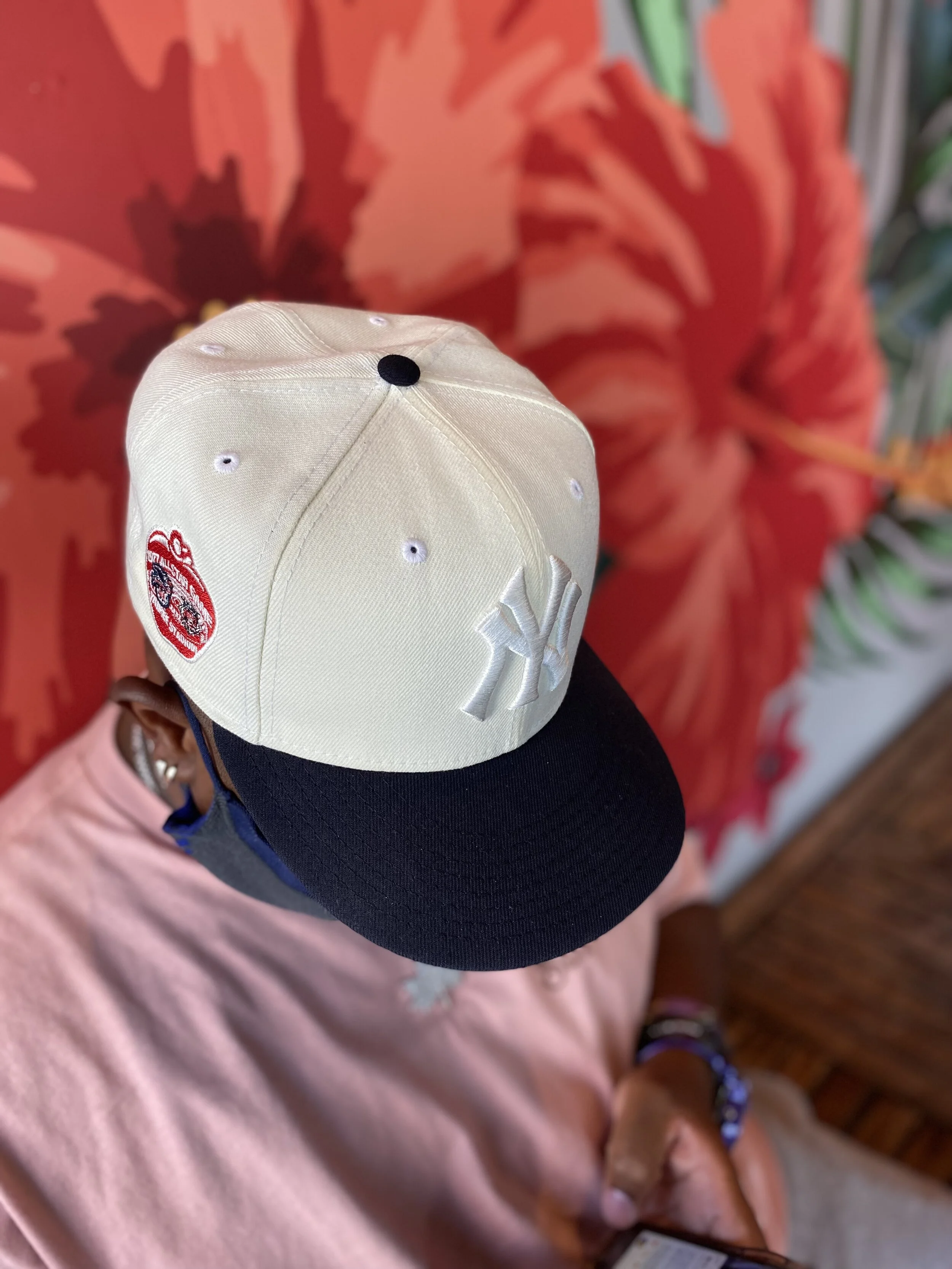
I once had a Conversation with my brothers about what a hat would look with no logo on the front and just a patch on the side. We knew that wild be hard to pull off. That got my thinking, what if I make the logo and the crown the same color to give the illusion that their was no logo on the front from far.
I used sail cause I wanted a old-school worn look. I made sure the brim was a traditional Yankee blue. I am a big fan of 2 Tone hats and I wanted to bring my own story to it.
The 1977 all star patch was used because I felt that Best represents New York City as a whole. With us being called the ( Big Apple) plus I just felt the red was going to be a nice pop on the side of the sail. ( Tmark for the ref.)
The reason why I called this had the champagne project is because I never thought I’d be able to come out with a fitted, So being able to be have a platform to create a color way that can represent me from my brothers was a victory in my eyes and usually when you win you pop champagne in celebration.
I’m very thankful to my brothers for this Opportunity. Not to forget the ppl I worked with on this X and Dino.